A little less than a year ago, I was talking about the design of the cover for The Shards of Heaven, my debut novel from Tor Books. Now here I am to talk about the design of the cover for its sequel, The Gates of Hell, which will be published this Fall. Time flies!
First, here it is:

I know, right?
So, how did this amazing cover happen?
Mostly because artists are artists and they do amazing things. We had already talked editorially about keeping the same “feel” for the covers in the series, so when I was asked if I had any thoughts about the cover for Book 2, here’s what I wrote to my editor, Claire Eddy:
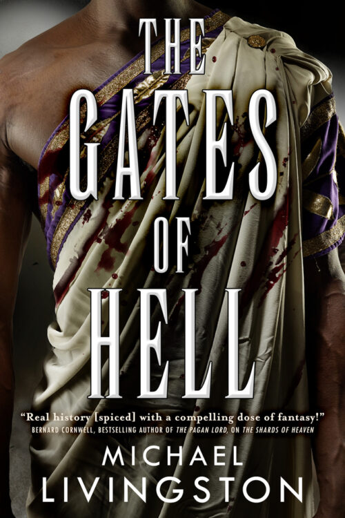
In this case, I’d like to see Juba on the cover, perhaps wearing a toga praetexta (a white toga with a broad purple border). I would very much like for some portion of his skin to be showing, so that we can see that he is of North African origin, young, and strong. If some “action” element is needed, you could splatter some blood across his chest (neatly symbolic because the toga praetexta is supposed to signify peace). If you need to go to “fantasy,” put Juba in a more common tunic and put the Aegis of Zeus over it (a Macedonian breastplate with the Shard at its center).
The real key, I emphasized, was that we have a person of color on the cover. I had some plot reasons for this — Juba is really important to the next stage in this story — but I also had some social ones, too, like the fact that there’s a kind of latent and self-perpetuating racism in the covers of too many fantasy novels. Simply put, they tend to be whiter than a Trump rally. So if my Historical Fantasy — set in Rome, no less — could in some small way stand as a balance for that, I was all for it.
In some form, this information went to the art department and thence to Larry Rostant, the artist who executed the magnificent cover for Shards.
As it turned out, Larry actually shot both options I had presented: Juba in the bloodied toga and Juba in the breastplate. Tor editorial presented both options to me. They were leaning toward the breastplate one (I don’t think I can show it to you all, sorry), because they worried that the toga one was too bloody. But they wanted to know what I thought.
I voted toga. Bloodiness and all.
So here we are: a new cover, a new book. I hope you’ll join me in the next stage of this grand adventure.
And just you wait until you see the cover for Book 3 next year!